Danie Marie Photography
Client: Danie Marie Photography
Type: Brand Strategy & Website Creation
Role: Strategy, Copywriting, Voice Development, Web Architecture, Logo Design
Timeline: 2025 – Present
Status: Live – daniemarie.photography
OVERVIEW
Danie Marie Photography is rooted in quiet moments, soft light, and the calm of nature. Based in southern Colorado, Danie’s work focuses on wildlife, birds, and the natural world—capturing beauty others might overlook. She’s an introvert, a mother, a cosplayer, and someone who finds her center outdoors. But when it came time to share her work, she needed a portfolio site that didn’t just show her photos—it had to feel like her.
Bratton Creative stepped in to help her build that digital home. One that was warm, minimal, and emotionally honest—without losing the grounded strength behind the lens.
WHAT WE DID
1. Voice Development & Tone Calibration
Danie’s brand voice was shaped to feel like a quiet conversation with someone you trust—warm but guarded, gentle but self-assured.
- Defined tone pillars: Calm, Centered, Observant
- Balanced emotional language with grounded clarity
- Wrote all copy in first-person to reflect her introverted authenticity
2. Website Architecture & Copywriting
Her site wasn’t built to sell—it was built to invite. Every page was crafted to guide visitors gently through her world without overwhelming them.
- Homepage: soft headline tone and clear path to galleries
- About Page: written like a personal letter—intimate, honest, and steady
- Contact Page: no-fluff message for those interested in prints or features
- Gallery Navigation: categorized by visual flow and subject clarity
3. Visual Flow & Portfolio Curation
With 600+ wildlife and nature photos to sort, we curated every gallery for both aesthetic flow and viewer experience.
- Reorganized galleries by subject (Birds, Wildlife, Flora & Fauna, Scenery)
- Ordered images by tone and color (bold first, then warm/cool gradients)
- Created hover overlays and consistent padding for a clean, tactile experience
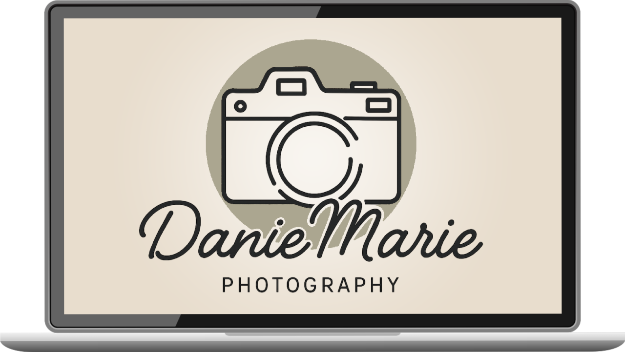
4. Logo, Brand Colors & Visual Identity
Ensured visual and verbal alignment across platforms by creating a consistent presence through color psychology, neutral backgrounds, and handcrafted logos and headers that reflect Danie’s style—soft, feminine, grounded.
- Logo design featuring camera icon + signature script
- Color palette based on Olive Mist and warm neutrals
- Font choices curated for softness and readability
RESULTS
- 4 fully built core pages (Home, About, Galleries, Contact), each written and designed from scratch—no templates, no AI, with more than 50+ curated images per category, carefully sorted across 4 themed galleries with visual flow mapping.
- 100% mobile-responsive experience, optimized for both visual browsing and user clarity, and custom logo, color palette, and brand identity created to match Danie’s tone and dedicated audience.
- Gallery views increased after relaunch, with anecdotal feedback from peers citing better organization and stronger emotional resonance.
- Used as portfolio centerpiece for feature requests and print inquiries, eliminating the need for PDF lookbooks or third-party platforms.
- Zero client confusion post-launch—visitors know who she is, what she does, and how to reach her within seconds of landing.
Bratton Creative is built for small businesses, freelancers, and outsiders who give a damn. If that’s you, we’ll make it work.
